Narzędzia użytkownika
Narzędzia witryny
Pasek boczny
en:statpqpl:aopisowapl
Spis treści
Descriptive analyses
The data collected by the researcher should first be described. Depending on how the measurements are made (on the measurement scale), different measures will be used to describe the variable.
Measuring scales
The correct determination of the type of analysis to be performed depends on the scale used to represent the collected data. There are 3 main measurement scales:
A variable is represented on an interval scale when:
- it can be organized,
- it can be calculated by how much one element is larger than the other and the difference of these elements has a real world interpretation. Usually a unit of measurement is specified.
Example: object mass [kg], object area [m], time [years], speed [km/h], etc.
A variable is represented on an ordinal scale when:
- it can be organized, i.e. the order in which the elements appear matters,
- there is no meaningful way to determine the difference or quotient between two values.
Example: education, order of competitors on the podium, etc.
Note
If a variable is expressed on an ordinal scale, then to be able to perform calculations on it properly it should be saved using numbers. These numbers are conventional identifiers that tell you the order of the elements.
A variable is expressed on a nominal scale when:
- it cannot be ordered, i.e. there is no order resulting from the nature of a given event.,
- The difference or quotient between two values cannot be determined in a meaningful way.
Example: gender, country of residence, etc.
Note
If a variable is expressed on a nominal scale, it can be stored using text labels. Even if the values of a nominal variable are expressed numerically, the numbers are only conventional identifiers, so you cannot perform arithmetic operations on them or compare them.
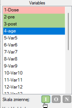
Before proceeding with analysis, it is recommended to assign measurement scales to individual variables. Such assignment will result in the variable headers gaining the corresponding color for the scale, i.e., green = interval scale, yellow = ordinal scale, red = nominal scale. The color of the variables (and therefore their scale) will be visible in the data sheet and in the list of variables in the analysis windows.
Assigning a scale to a selected variable can be done in the variable options window Codes/Labels/Format or in the context menu on the header of the selected variable.
Quantitative data are any information that can be quantified, counted or measured and given a numerical value. Quantitative data include the interval scale and sometimes also the ordinal scale.
Qualitative data are descriptive in nature, expressed in linguistic terms rather than in numerical values. Qualitative data include a nominal scale and sometimes also an ordinal scale.
An ordinal scale that has a possible number of objectified categories is quantitative data, e.g., the SF-36 quality of life scale (from 0 to 100 points), but if there are so few categories that can be described by text, e.g., education (primary, secondary, tertiary), then it is qualitative data.
Tables
Frequency tables and empirical distribution of the data
The basis of statistical research is the determination of the empirical distribution, i.e., the distribution of a feature observed in a sample. The empirical distribution is determined by assigning a frequency of occurrence to successive values of the feature. Such distribution can be presented in the form of frequency table or as a graph (histogram). For small data sets, frequency tables can present all data - the so-called point distribution series, while for larger data sets the so-called interval distribution series are created.
To represent the data distribution in table form, bring up the Frequency tables window by selecting menu Statistics→Descriptive analysis→Frequency tables.
In this window we choose a variable to analyse and options for analysis. You can sort the output as a text or as a number by selecting the appropriate options. If there are empty cells in the analysed column, they may be included or omitted in the analysis. The result of analysis will be placed in report attached to datasheet, for which analysis has been done.
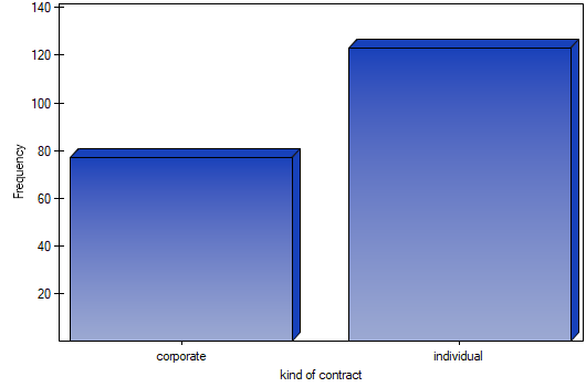
In addition, if you want the data to be visualized with a column chart or histogram, then in the Frequency table window, check the Add graph option..
EXAMPLE (distribution.pqs file)
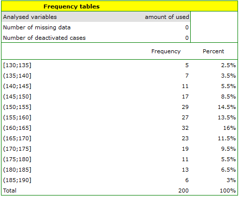
A mobile operator conducts a series of surveys on how customers use the number of „free minutes” they are given in their subscription. Customers can use up to 190 such minutes each month. The study was based on a random sample of 200 customers. Information analysed included:
- type of subscription purchased,
- number of free minutes used,
- number of subscriptions registered for a given customer (does not apply to companies).
We want to present the distribution of:
- type of subscription,
- number of free minutes used,
- number of registered subscriptions for an individual person.
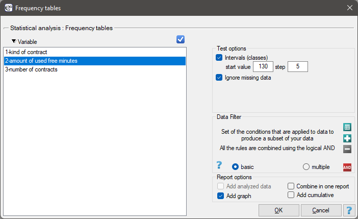
Open the Frequency table window..
- Select the
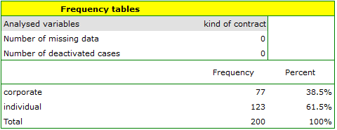
Variableto analyse: „type of subscription” andAdd graph. Then confirm the selected settings withOKbutton and the result is obtained as a report:
- Resume Analysis by pressing
 . We select the
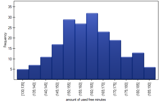
 variableto analyse: „amount of used free minutes” and check the optionIntervals (classes), setstart valuefor example to 130 andstepto 5. We can also check the optionAdd graph. Then confirm the selected options withOKand the result is obtained as a report:
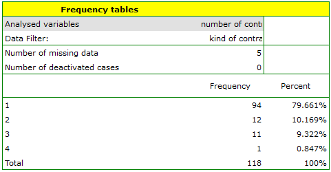
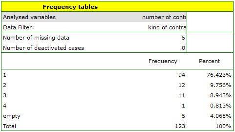
- Resume Analysis by pressing. We set filter so that the analysis is performed only for individuals. We select the
variableto analyse: „Number of subscriptions”. Since this variable also contains missing data, the result obtained may or may not include these missing cases in the analysis, depending on the option selected:
EXAMPLE (fertiliser.pqs file)
An experiment was conducted to study the microbiological condition of soil under perennial ryegrass cultivation supplied with biologically active fertilizers. Soils were fertilized with different types of microbial preparations and fertilizers and then the number of microorganisms present per gram of soil dry matter was calculated. We want to know the frequency of actinomycetes per 1 gram of dry nitrogen fertilized soil. We are interested in how often 0 to 20 actinomycetes were present in the sample, more than 20 to 40 actinomycetes, more than 40 to 60 actinomycetes, etc. We select only the first 54 rows in the datasheet that match the assumptions of the analysis (these are nitrogen-fertilized actinomycetes) and open the Frequency Tables.
In the options window, we select the variable to be analysed: Number of microorganisms, and then set the class intervals so that the start value is 0 and the step is 20. You should see a message at the top of the window: \textcolor{black}{
Data limited by selection
. Confirm the selection with the OK button and the result should appear as a report:
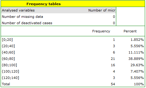
Table report
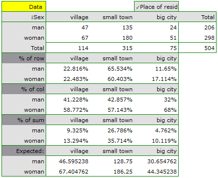
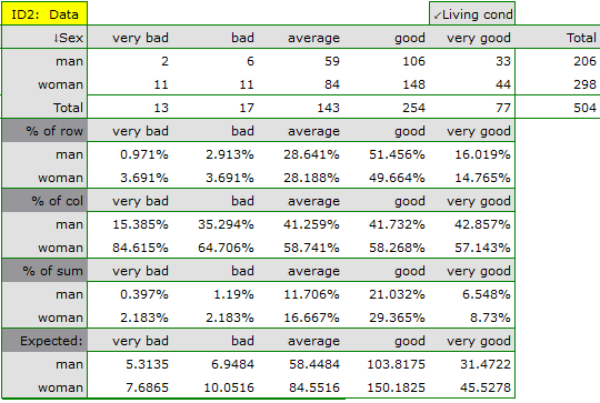
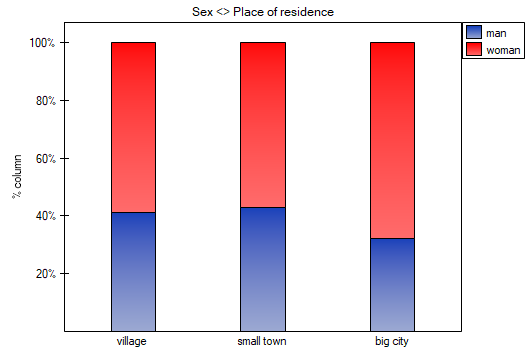
Using a table report, you can prepare a simultaneous summary of a large amount of data in the form of bivariate tables (tables of two features). For example, we can present the distribution of age groups by place of residence, education, etc. in the form of a table. Each table is presented in the form of frequency in particular categories, and additionally, it can be summarized by calculating percentages from a row, from a column, or from the total sum, and determining the frequency table expected. In addition, automatic summaries in the form of a column chart are possible for such tables.
The window with the table report settings is opened via menu Statistics→Descriptive analysis→Table report
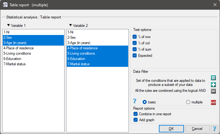
In the form of tables, we need to summarize the distribution of gender by place of residence, social and living conditions, education, marital status, and the distribution of age groups with respect to the same characteristics. This will result in 4 tables for each pair of traits, or 8 tables for all pairs and corresponding graphs. Only the distribution with respect to gender is presented below:
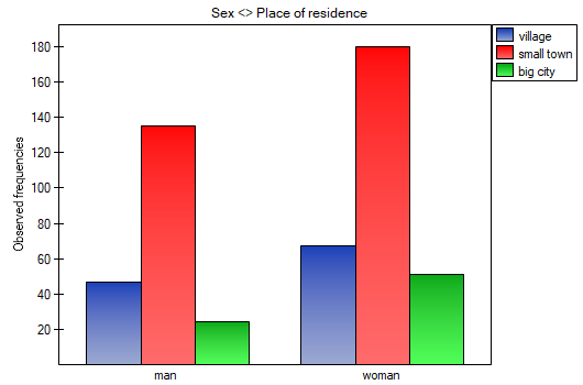
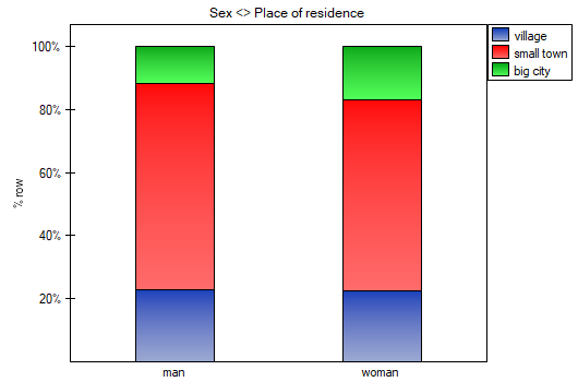

For the distribution with respect to age groups, age categories were first created through codes/labels/format.
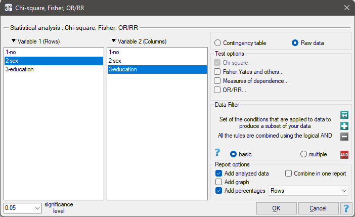
Analyses for contingency tables
Analyses for the contingency tables can be computed from data collected in the contingency tables or directly i.e., from raw data. Whereby it is possible to transform the data from the contingency table to the raw form or vice versa.
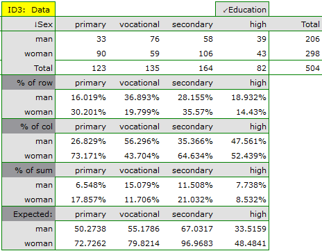
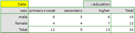
EXAMPLE (sex-education.pqs file)
Consider a sample consisting of 34 individuals ( ). We examine 2 traits of these individuals (
 =sex,
=sex,  =education). Gender appears in 2 categories (
 =female,
  =male) education in 3 categories, (
 =primary + vocational
  =medium,
  =higher).
In the case of raw data, when you open the test options window, e.g., the  for the
  tables, the
 raw data option will automatically be selected..
For data collected in a contingency table, it is a good idea to select this data (numerical values without headers) before opening the test window. Then, when you open the test window, the contingency table option will automatically be selected and the data from the selection will be displayed.
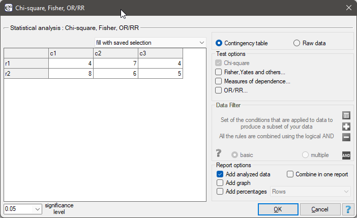
In the test window, we can always change the automatically detected setting regarding the form of data organization, as well as enter data into the contingency table from the window.
This is a basic condition for using many statistical tests based on contingency tables, e.g., the chi-square test. This condition implies a large expectred frequencies. According to Cochran's 1952 interpretation1), none of the expected frequencies can be  and no more than 20% can be
  . Information about whether this condition is met (or not) by the data collected in the table can be returned to the report.
Basic tests for contingency tables:
Coefficients for contingency tables:
You can also include a basic summary of the tables in the results report:
 and the second
  categories are shown below).

Frequencies observed  (
( ) represent the frequency of each category for both traits.
In order for such a table to be returned by the program, the option include analysed data should be selected in the test window. For the data from the example, the contingency table of observed frequencies is as follows:
 can be created
 ,
,  ,
, 
 ,
,  ,
, 
 ,
,  ,
,  .
.
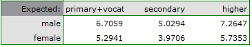
For the data in the example The contingency table of expected frequencies is as follows:
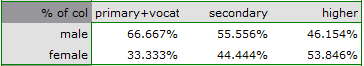
- Contingency table of percentages calculated from the sum of columns. For the data in the example this table is as follows:
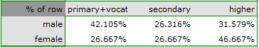
- Tcontingency table of percentages calculated from the sum of the rows. For the data in the example this table is as follows:
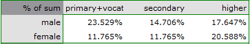
- A contingency table of percentages calculated from the sum of the total rows and columns. For the data in the example this table is as follows:
Descriptive statistics
The purpose of using descriptive statistical methods is to summarize a set of data by certain characteristics, e.g., by the value of the mean, median, or standard deviation, and to draw some basic conclusions and generalizations about the dataset.
To calculate descriptive statistics for the data collected in the datasheet, open the Descriptive statistics window via menu Statistics→Descriptive analysis→Descriptive statistics.
In this window, we select the variable to be analysed and the analysis settings and select the descriptive statistics measures we are interested in. You may select individual statistics or groups of statistics by clicking on the  . Confirm the selection by pressing
 OK. The result of the analysis will be in a report attached to the datasheet for which the analysis was performed.
In addition, if you want the data to be visualized with a box-and-whisker chart, then in the Descriptive statistics window select the Add graph.
Location measures
Measures of central tendency
Measures of central tendency are so-called average measures that characterize the average or typical level of a trait's values.
Arithmetic mean is expressed by the formula:

where  is the consecutive values of the variable and
  is the sample size.
The arithmetic mean is used for interval scale. For a sample it is taken to be denoted by  and for a population by
  .
.
Trimmed mean - is determined as the arithmetic mean calculated after removing from the sample a given percentage of the smallest and largest measurements, e.g. if we cut off 5 per cent of the measurements, it means that we cut off 2.5 per cent of the largest and 2.5 per cent of the smallest values. At the same time, if the number of measurements to be removed obtained from the conversion is not an integer, it is rounded down to the nearest whole number.
Winsor mean - is determined as the arithmetic mean calculated after replacing the appropriate percentage of extreme measurements with the smallest and largest value that remains of the reduced set of values. If we choose to calculate the Winsor average by pruning, say, 5% of the measurements, then those discarded 5% will be replaced by the smallest and largest value determined from the remaining 95% of the measurements. As with the pruned average, when converting the percentage of values to be replaced to the number of measurements to be replaced does not result in an integer, then we round down to the nearest integer.
Geometric mean is expressed by the formula:
![\begin{displaymath}
\overline{x}_G=\sqrt[n]{x_1x_2...x_n}=\sqrt[n]{\prod_{i=1}^n x_i}.
\end{displaymath}](/lib/exe/fetch.php?media=wiki:latex:/img011017a5d163d0e6305611f865ade072.png "LaTeX") This mean is used for the interval scale, when the variable has a log-normal distribution (the logarithm of the variable has a normal distribution).
This mean is used for the interval scale, when the variable has a log-normal distribution (the logarithm of the variable has a normal distribution).
Harmonic mean is expressed by the formula:
 This mean is used for the interval scale.
In an ordered data set, the median is the value that divides the data set into two equal parts. Half of all observations are below and half are above the median.
![\begin{pspicture}(0,0)(3,4.6)
\pscoil[coilaspect=0, coilarm=.1cm, linewidth=0.5pt, coilwidth=.5cm, coilheight=1]{-}(0,4)
\rput(0,4.2){min}
\rput(0,-.2){max}
\psline(-0.35,2)(.35,2)
\rput(1.2,2){median}
\rput(-0.6,2.8){50$\%$}
\rput(-0.6,1.2){50$\%$}
\end{pspicture}](/lib/exe/fetch.php?media=wiki:latex:/img9b976478cd579bfe4153c57aa2d6d11a.png "LaTeX")
The median can be used in interval and ordinal scale.
Mode  is the value that occurs most frequently among the measurements obtained. Fashion can be used at any measurement scale.
Other measures of location
![\begin{pspicture}(0,-.2)(4,4.4)
\pscoil[coilaspect=0, coilarm=.1cm, linewidth=0.5pt, coilwidth=.5cm, coilheight=1]{-}(0,4)
\rput(0,4.2){max}
\rput(0,-.2){min}
\psline(-0.35,3)(.35,3)
\psline(-0.35,2)(.35,2)
\psline(-0.35,1)(.35,1)
\rput(2.9,3){$C_{75}$ = upper quartile = $Q_3$}
\rput(2.4,2){$C_{50}$ = median = $Q_2$}
\rput(2.9,1){$C_{25}$ = lower quartile = $Q_1$}
\rput(1,3.5){25$\%$}
\rput(1,2.5){25$\%$}
\rput(1,1.5){25$\%$}
\rput(1,.5){25$\%$}
\end{pspicture}](/lib/exe/fetch.php?media=wiki:latex:/img69d36b9c4fb1b5c0f0c2dccadaee5151.png "LaTeX")
Quartiles ( ,
,  ,
,  ) divide the ordered series into 4 equal parts, deciles (
 ,
,  ) into 10 equal parts and centiles (percentiles:
  ,
,  ) into 100 equal parts. The second quartile, fifth decile, and fiftieth centile are equal to the median. These measures can be used in the interval and ordinal scale.
Measures of variability (dispersion)
Central tendency measures knowledge is not enough to fully describe a statistical data collection structure. The researched groups may have various variation levels of a feature you want to analyse. You need some formulas then, which enable you to calculate values of variability of the features.
Measures of variability are calculated only for an interval scale, because they are based on the distance between the points.

where are values of the analysed variable

where  are the lower and the upper quartile.
Ranges for a percentile scale (decile, centile)
Ranges between percentiles are one of the dispersion measures. They define a percentage of all observations, which are located between the chosen percentiles.
Variance measures a degree of spread of the measurements around arithmetic mean
- sample variance:

where are following values of variable and is an arithmetic mean of these values, n - sample size;
- population variance:

where are following values of variables and is an arithmetic mean of these values,  - population size;
Variance is always positive, but it is not expressed in the same units as measuring results.
Standard deviation measures a degree of spread of the measurements around arithmetic mean.
- sample standard deviation:

- population standard deviation:

The higher standard deviation or a variance value is, the more diversed is the group in relation to an analysed feature.
Note
The sample standard deviation is a kind of approximation (estimator) of the population standard deviation. The population standard deviation value is included in a range which contains the sample standard deviation. This range is called a **confidence interval ** for standard deviation.
Coefficient of variation, just like standard deviation, enables you to estimate the homogeneity level of an analysed data collection. It is formulated as:

where  means standard deviation, means arithmetic mean.
This is a unitless value. It enables you to compare a diversity of several different datasets of a one feature. And also, you are able to compare a diversity of several features (expressed in different units). It is assumed, if  coefficient does not exceed 10%, features indicate a statistically insignificant diversity.
Standard errors they are not measures of a measurement dispersion. They measure an accuracy level, you can define the population parameters value, having just the sample estimators.
Standard error of the mean is defined by:

Note
On the basis of a sample estimator you can calculate a confidence interval for a population parameter.
Another distribution characteristics
Skewness or asymmetry coefficient in other words
This measure tells us how data distribution differs from symmetrical distribution. The closer the value of skewness is to zero, the more symmetrically around the mean the data are spread. Usually the value of this coefficient is included in a range [-1, 1], but in the case of a very big asymmetry, it may occur outside the above-mentioned range. A positive skew value indicates that the right skew occurs (the tail on the right side is longer), whereas the negative skew indicates that the left skew occurs (the tail on the left side is longer). Skewness is defined by:

where:
the following values of a variable,
, adequately - arithmetic mean and standard deviation ,
sample size.
![\begin{tabular}{cc}
\begin{pspicture}(0,-.7)(7,3.6)
\rput(2.5,3.3){right skew}
\rput(2.8,2.8){$A>0$}
\psline{->}(0,0)(0,3)
\psline{->}(0,0)(6.3,0)
\psbezier{-}(.2,.2)(.5,.2)(.7,2.3)(1.3,2.5)
\psbezier{-}(1.3,2.5)(2,2.5)(3,.2)(5.3,.2)
\psline[linestyle=dotted]{-}(2.2,0)(2.2,1.7)
\rput(2.55,-.3){Med.}
\psline[linestyle=dotted]{-}(1.3,0)(1.3,2.5)
\rput(1.3,-.3){Mode}
\psline[linestyle=dotted]{-}(3.4,0)(3.4,.7)
\rput(3.5,-.3){$\overline{X}$}
\rput{90}(-.4,2.7){frequency}
\rput(6.1,-.3){x}
\end{pspicture}
&
\begin{pspicture}(0,-.7)(7,3.6)
\rput(2.5,3.3){left skew}
\rput(2.2,2.8){$A<0$}
\psline{->}(0,0)(0,3)
\psline{->}(0,0)(6.3,0)
\psbezier{-}(.2,.2)(2.1,.2)(2.8,2.5)(3.7,2.5)
\psbezier{-}(3.7,2.5)(4.2,2.5)(4.8,.2)(5.5,.2)
\psline[linestyle=dotted]{-}(2.85,0)(2.85,1.75)
\rput(2.7,-.3){Med.}
\psline[linestyle=dotted]{-}(3.7,0)(3.7,2.5)
\rput(3.9,-.3){Mode}
\psline[linestyle=dotted]{-}(1.7,0)(1.7,.7)
\rput(1.7,-.3){$\overline{X}$}
\rput{90}(-.4,2.7){frequency}
\rput(6.1,-.3){x}
\end{pspicture}
\end{tabular}](/lib/exe/fetch.php?media=wiki:latex:/imgb616b2d9bf5953a039c638b20718103a.png "LaTeX")
Kurtosis or coefficient of concentration
This measure tells us how much the spread of data around the mean is similar to the spread of data in normal distribution. The greater than zero the value of kurtosis is, the more narrow the tested distribution than normal one is. And inversely, the lower than zero the value of kurtosis is, the flatter the tested distribution than the normal one is. Kurtosis is defined by:

where:
the following values of a variable,
, adequately - arithmetic mean and standard deviation of ,
sample size.
![\begin{pspicture}(0,-.8)(6.5,3.4)
\rput(4.0,.7){$K_1<0$}
\rput(4.5,2.5){$K_2>0$}
\psline{->}(0,0)(0,3)
\psline{->}(0,0)(7,0)
\psbezier[linestyle=dashed]{-}(.2,.2)(2.2,.8)(2.3,1.4)(3.2,1.5)
\psbezier[linestyle=dashed]{-}(3.2,1.5)(4.1,1.4)(4.2,.8)(6.2,.2)
\psbezier{-}(.4,.2)(2.4,.6)(2.5,3.0)(3.2,3.1)
\psbezier{-}(3.2,3.1)(3.9,3.0)(4.0,.6)(6.0,.2)
\psline[linestyle=dotted]{-}(3.2,0)(3.2,3.1)
\rput(3.2,-.3){$\overline{X}$}
\rput{90}(-.4,2.7){frequency}
\rput(6.8,-.3){x}
\end{pspicture}](/lib/exe/fetch.php?media=wiki:latex:/imgbf7cfbcbebc1559097db5330b148fb7d.png "LaTeX")
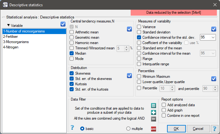
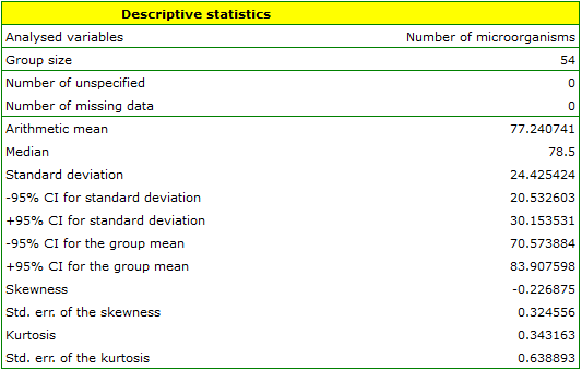
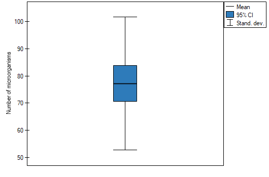
EXAMPLE (fertilisers.pqs file)
In an experiment related to a soil fertilising the with various sorts of microbiological specimens and fertilisers it was calculated how many microorganisms occur in a 1 gramme of dry mass of soil. Now we would like to calculate descriptive statistics of the amount of actinomycetes for the sample fertilised with nitrogen. Additionally, we want the data to be illustrated in the Box-Whiskers plot. In a datasheet, we select only the 54 first rows, which are relevant to the assumptions of the analysis (there are actinomycetes fertilised with nitrogen). Then we open Descriptive statistics window in Statistics menu→Descriptive analysis→Descriptive statistics.
In the window of descriptive statistics options, select a variable to analyse: the number of microorganisms, and then all the procedures you want to follow (for example arithmetic mean altogether with the confidence interval, median, standard deviation altogether with the confidence interval, and an information about the skewness and kurtosis of distribution altogether with errors). At the top of the window you should see the following message:
Data limited by the selected area
. To add a graph to the report, we select Add graph option and chose the Box-Whiskers plot type. Confirm your choice by clicking OK and you get the result in a report:
1)
Cochran W.G. (1952), The chi-square goodness-of-fit test. Annals of Mathematical Statistics, 23, 315-345
en/statpqpl/aopisowapl.txt · ostatnio zmienione: 2023/03/31 22:15 przez admin
Narzędzia strony
Wszystkie treści w tym wiki, którym nie przyporządkowano licencji, podlegają licencji: CC Attribution-Noncommercial-Share Alike 4.0 International
