Narzędzia użytkownika
Narzędzia witryny
Pasek boczny
en:statpqpl:aopisowapl:statopispl:innearpl
Another distribution characteristics
Skewness or asymmetry coefficient in other words
This measure tells us how data distribution differs from symmetrical distribution. The closer the value of skewness is to zero, the more symmetrically around the mean the data are spread. Usually the value of this coefficient is included in a range [-1, 1], but in the case of a very big asymmetry, it may occur outside the above-mentioned range. A positive skew value indicates that the right skew occurs (the tail on the right side is longer), whereas the negative skew indicates that the left skew occurs (the tail on the left side is longer). Skewness is defined by:

where:

 the following values of a variable,
 ,
,  adequately - arithmetic mean and standard deviation ,
 sample size.
![\begin{tabular}{cc}
\begin{pspicture}(0,-.7)(7,3.6)
\rput(2.5,3.3){right skew}
\rput(2.8,2.8){$A>0$}
\psline{->}(0,0)(0,3)
\psline{->}(0,0)(6.3,0)
\psbezier{-}(.2,.2)(.5,.2)(.7,2.3)(1.3,2.5)
\psbezier{-}(1.3,2.5)(2,2.5)(3,.2)(5.3,.2)
\psline[linestyle=dotted]{-}(2.2,0)(2.2,1.7)
\rput(2.55,-.3){Med.}
\psline[linestyle=dotted]{-}(1.3,0)(1.3,2.5)
\rput(1.3,-.3){Mode}
\psline[linestyle=dotted]{-}(3.4,0)(3.4,.7)
\rput(3.5,-.3){$\overline{X}$}
\rput{90}(-.4,2.7){frequency}
\rput(6.1,-.3){x}
\end{pspicture}
&
\begin{pspicture}(0,-.7)(7,3.6)
\rput(2.5,3.3){left skew}
\rput(2.2,2.8){$A<0$}
\psline{->}(0,0)(0,3)
\psline{->}(0,0)(6.3,0)
\psbezier{-}(.2,.2)(2.1,.2)(2.8,2.5)(3.7,2.5)
\psbezier{-}(3.7,2.5)(4.2,2.5)(4.8,.2)(5.5,.2)
\psline[linestyle=dotted]{-}(2.85,0)(2.85,1.75)
\rput(2.7,-.3){Med.}
\psline[linestyle=dotted]{-}(3.7,0)(3.7,2.5)
\rput(3.9,-.3){Mode}
\psline[linestyle=dotted]{-}(1.7,0)(1.7,.7)
\rput(1.7,-.3){$\overline{X}$}
\rput{90}(-.4,2.7){frequency}
\rput(6.1,-.3){x}
\end{pspicture}
\end{tabular}](/lib/exe/fetch.php?media=wiki:latex:/imgb616b2d9bf5953a039c638b20718103a.png "LaTeX")
Kurtosis or coefficient of concentration
This measure tells us how much the spread of data around the mean is similar to the spread of data in normal distribution. The greater than zero the value of kurtosis is, the more narrow the tested distribution than normal one is. And inversely, the lower than zero the value of kurtosis is, the flatter the tested distribution than the normal one is. Kurtosis is defined by:

where:
the following values of a variable,
, adequately - arithmetic mean and standard deviation of ,
sample size.
![\begin{pspicture}(0,-.8)(6.5,3.4)
\rput(4.0,.7){$K_1<0$}
\rput(4.5,2.5){$K_2>0$}
\psline{->}(0,0)(0,3)
\psline{->}(0,0)(7,0)
\psbezier[linestyle=dashed]{-}(.2,.2)(2.2,.8)(2.3,1.4)(3.2,1.5)
\psbezier[linestyle=dashed]{-}(3.2,1.5)(4.1,1.4)(4.2,.8)(6.2,.2)
\psbezier{-}(.4,.2)(2.4,.6)(2.5,3.0)(3.2,3.1)
\psbezier{-}(3.2,3.1)(3.9,3.0)(4.0,.6)(6.0,.2)
\psline[linestyle=dotted]{-}(3.2,0)(3.2,3.1)
\rput(3.2,-.3){$\overline{X}$}
\rput{90}(-.4,2.7){frequency}
\rput(6.8,-.3){x}
\end{pspicture}](/lib/exe/fetch.php?media=wiki:latex:/imgbf7cfbcbebc1559097db5330b148fb7d.png "LaTeX")
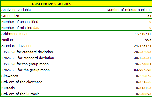
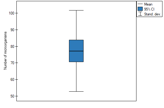
EXAMPLE (fertilisers.pqs file)
In an experiment related to a soil fertilising the with various sorts of microbiological specimens and fertilisers it was calculated how many microorganisms occur in a 1 gramme of dry mass of soil. Now we would like to calculate descriptive statistics of the amount of actinomycetes for the sample fertilised with nitrogen. Additionally, we want the data to be illustrated in the Box-Whiskers plot. In a datasheet, we select only the 54 first rows, which are relevant to the assumptions of the analysis (there are actinomycetes fertilised with nitrogen). Then we open Descriptive statistics window in Statistics menu→Descriptive analysis→Descriptive statistics.
In the window of descriptive statistics options, select a variable to analyse: the number of microorganisms, and then all the procedures you want to follow (for example arithmetic mean altogether with the confidence interval, median, standard deviation altogether with the confidence interval, and an information about the skewness and kurtosis of distribution altogether with errors). At the top of the window you should see the following message:
Data limited by the selected area
. To add a graph to the report, we select Add graph option and chose the Box-Whiskers plot type. Confirm your choice by clicking OK and you get the result in a report:
en/statpqpl/aopisowapl/statopispl/innearpl.txt · ostatnio zmienione: 2022/03/02 18:00 przez admin
Narzędzia strony
Wszystkie treści w tym wiki, którym nie przyporządkowano licencji, podlegają licencji: CC Attribution-Noncommercial-Share Alike 4.0 International
