Narzędzia użytkownika
Narzędzia witryny
Pasek boczny
en:statpqpl:redpl
Spis treści
Dimension reduction and grouping
As the number of variables subjected to a statistical analysis grows, their precision grows, but so does the level of complexity and difficulty in interpreting the obtained results. Too many variables increase the risk of their mutual correlation. The information carried by some variables can, then, be redundant, i.e. a part of the variables may not bring in new information for analysis but repeat the information already given by other variables. The need for dimension reduction (a reduction of the number of variables) has inspired a whole group of analyses devoted to that issue, such as: factor analysis, principal component analysis, cluster analysis or discriminant analysis. Those methods allow the detection of relationships among the variables. On the basis of those relationships one can distinguish, for further analysis, groups of similar variables and select only one representative (one variable) of each group, or a new variable the values of which are calculated on the basis of the remaining variables in the group. As a result, one can be certain that the information carried by each group is included in the analysis. In this manner we can reduce a set of variables  to a set of variables
  where
where 
Similarly to grouping variables, we may be interested in grouping objects. Having at our disposal information about certain characteristics of objects, we are often able to distinguish groups of objects similar in terms of those characteristics, e.g. based on information about the amounts spent by customers of a certain store chain on particular items, we can divide customers in such a way as to distinguish customer segments with similar shopping preferences. As a result, your offer/advertising can be prepared not for the general public, but separately for each segment, so as to more precisely meet the needs of a potential customer.
Principal Component Analysis
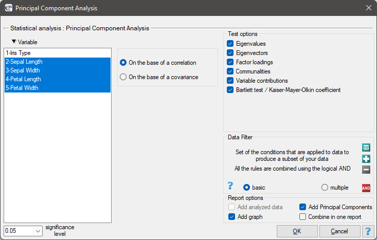
The window with settings for Principal component analysis is accessed via the menu Advenced statistics → Multivariate Models → Principal Component Analysis.
Principal component analysis involves defining completely new variables (principal components) which are a linear combination of the observed (original) variables. An exact analysis of the principal components makes it possible to point to those original variables which have a big influence on the appearance of particular principal components, that is those variables which constitute a homogeneous group. A principal component is then a representative of that group. Subsequent components are mutually orthogonal (uncorrelated) and their number () is lower than or equal to the number of original variables ().
Particular principal components are a linear combination of original variables:
 where:
 – original variables,
 – coefficients of the
  th principal component
Each principal component explains a certain part of the variability of the original variables. They are, then, naturally based on such measures of variability as covariance (if the original variables are of similar size and are expressed in similar units) or correlation (if the assumptions necessary in order to use covariance are not fulfilled).
Mathematical calculations which allow the distinction of principal components include defining the eigenvalues and the corresponding eigenvectors from the following matrix equation:
 where:
 – eigenvalues,
 – eigenvector corresponding to the th eigenvalue,
 – the variance matrix or covariance matrix of original variables ,
 – identity matrix (1 on the main diagonal, 0 outside of it).
EXAMPLE cont. (iris.pqs file)
Interpretation of coefficients related to the analysis
Every principal component is described by:
- Eigenvalue
An eigenvalue informs about which part of the total variability is explained by a given principal component. The first principal component explains the greatest part of variance, the second principal component explains the greatest part of that variance which has not been explained by the previous component, and the subsequent component explains the greatest part of that variance which has not been explained by the previous components. As a result, each subsequent principal component explains a smaller and smaller part of the variance, which means that the subsequent values are smaller and smaller.
Total variance is a sum of the eigenvalues, which allows the calculation of the variability percentage defined by each component.

Consequently, one can also calculate the cumulative variability and the cumulative variability percentage for the subsequent components.
- Eigenvector
An eigenvector reflects the influence of particular original variables on a given principal component. It contains the coefficients of a linear combination which defines a component. The sign of those coefficients points to the direction of the influence and is accidental which does not change the value of the carried information.
- Factor loadings
Factor loadings, just as the coefficients included in the eigenvector, reflect the influence of particular variables on a given principal component. Those values illustrate the part of the variance of a given component is constituted by the original variables. When an analysis is based on the correlation matrix, we interpret those values as correlation coefficients between original variables and a given principal value.
- Variable contributions
They are based on the determination coefficients between original variables and a given principal component. They show what percentage of the variability of a given principal component can be explained by the variability of particular original variables.
- Communalities
They are based on the determination coefficients between original variables and a given principal component. They show what percentage of a given original variable can be explained by the variability of a few initial principal components. For example: the result concerning the second variable contained in the column concerning the fourth principal component tells us what percent of the variability of the second variable can be explained by the variability of four initial principal components.
EXAMPLE cont. (iris.pqs file)
Graphical interpretation
A lot of information carried by the coefficients returned in the tables can be presented on one chart. The ability to read charts allows a quick interpretation of many aspects of the conducted analysis. The charts gather in one place the information concerning the mutual relationships among the components, the original variables, and the cases. They give a general picture of the principal components analysis which makes them a very good summary of it.
Factor loadings graph
The graph shows vectors connected with the beginning of the coordinate system, which represent original variables. The vectors are placed on a plane defined by the two selected principal components.
{3}
\psline{->}(0,0)(2.5,1)
\rput(2.5,0.8){A}
\psline{->}(0,0)(2.7,1.3)
\rput(2.4,1.43){B}
\psline{->}(0,0)(1,1)
\rput(0.7,1){C}
\psline{->}(0,0)(-1.5,0.3)
\rput(-1.4,0.5){D}
\psline{->}(0,0)(-2,-2)
\rput(-2,-1.7){E}
\end{pspicture}](/lib/exe/fetch.php?media=wiki:latex:/imga791b18820caf03e86415963084a97c1.png "LaTeX")
- The coordinates of the terminal points of the vector are the corresponding factor loadings of the variables.
- Vector length represents the information content of an original variable carried by the principal components which define the coordinate system. The longer the vector the greater the contribution of the original variable to the components. In the case of an analysis based on a correlation matrix the loadings are correlations between original variables and principal components. In such a case points fall into the unit circle. It happens because the correlation coefficient cannot exceed one. As a result, the closer a given original variable lies to the rim of the circle the better the representation of such a variable by the presented principal components.
- The sign of the coordinates of the terminal point of the vector i.e. the sign of the loading factor, points to the positive or negative correlation of an original variable and the principal components forming the coordination system. If we consider both axes (2 components) together then original variables can fall into one of four categories, depending on the combination of signs (
 ) and their loading factors.
 - The angle between vectors indicates the correlation of original values:
 – the smaller the angle between the vectors representing original variables, the stronger the positive correlation among these variables.
 – the vectors are perpendicular, which means that the original variables are not correlated.
 – the greater the angle between the vectors representing the original variables, the stronger the negative correlation among these variables.
Biplot
The graph presents 2 series of data placed in a coordinate system defined by 2 principal components. The first series on the graph are data from the first graph (i.e. the vectors of original variables) and the second series are points presenting particular cases.

\psdot[dotsize=3pt](0.8,0)
\psdot[dotsize=3pt](1.1,0.2)
\psdot[dotsize=3pt](2,-1.6)
\psdot[dotsize=3pt](1.3,0)
\psdot[dotsize=3pt](-1.6,1.9)
\psdot[dotsize=3pt](-1.2,-1)
\psdot[dotsize=3pt](1.3,0.5)
\psdot[dotsize=3pt](1,0.6)
\psdot[dotsize=3pt](0.2,-1.6)
\psdot[dotsize=3pt](-0.6,0.2)
\psdot[dotsize=3pt](-0.8,-1)
\psdot[dotsize=3pt](1.9,0.7)
\psdot[dotsize=3pt](1.8,-1.2)
\psdot[dotsize=3pt](-1.8,-1)
\psdot[dotsize=3pt](1.4,0.8)
\psdot[dotsize=3pt](-0.6,-1.8)
\psdot[dotsize=3pt](1.1,0.3)
\psdot[dotsize=3pt](0.1,-1)
\psdot[dotsize=3pt](-1.7,-1)
\psdot[dotsize=3pt](1,-0.2)
\psdot[dotsize=3pt](-0.4,-1.3)
\psdot[dotsize=3pt](-1.1,-0.2)
\psdot[dotsize=3pt](-0.1,-0.3)
\psdot[dotsize=3pt](0.9,-0.9)
\psdot[dotsize=3pt](-0.1,0.5)
\psdot[dotsize=3pt](2,1.9)
\psdot[dotsize=3pt](-1.5,-1)
\psdot[dotsize=3pt](-1.5,1.1)
\psdot[dotsize=3pt](0.6,-0.6)
\psline{->}(0,0)(2.5,1)
\rput(2.5,0.8){A}
\psline{->}(0,0)(2.7,1.3)
\rput(2.4,1.43){B}
\psline{->}(0,0)(1,1)
\rput(0.7,1){C}
\psline{->}(0,0)(-1.5,0.3)
\rput(-1.4,0.5){D}
\psline{->}(0,0)(-2,-2)
\rput(-2,-1.7){E}
\end{pspicture}](/lib/exe/fetch.php?media=wiki:latex:/img2b39b527c98bf4a4b17471e1b7b9c745.png "LaTeX")
- Point coordinates should be interpreted as standardized values, i.e. positive coordinates pointing to a value higher than the mean value of the principal component, negative ones to a lower value, and the higher the absolute value the further the points are from the mean. If there are untypical observations on the graph, i.e. outliers, they can disturb the analysis and should be removed, and the analysis should be made again.
- The distances between the points show the similarity of cases: the closer (in the meaning of Euclidean distance) they are to one another, the more similar information is carried by the compared cases.
- Orthographic projection of points on vectors are interpreted in the same manner as point coordinates, i.e. projections onto axes, but the interpretation concerns original variables and not principal components. The values placed at the end of a vector are greater than the mean value of the original variable, and the values placed on the extension of the vector but in the opposite direction are values smaller than the mean.
EXAMPLE cont. (iris.pqs file)
The criteria of dimension reduction
There is not one universal criterion for the selection of the number of principal components. For that reason it is recommended to make the selection with the help of several methods.
- The percentage of explained variance
The number of principal components to be assumed by the researcher depends on the extent to which they represent original variables, i.e. on the variance of original variables they explain. All principal components explain 100\% of the variance of original variables. If the sum of the variances for a few initial components constitutes a large part of the total variance of original variables, then principal components can satisfactorily replace original variables. It is assumed that the variance should be reflected in principal components to the extent of over 80 percent.
- Kaiser criterion
According to the Kaiser criterion the principal components we want to leave for interpretation should have at least the same variance as any standardized original variable. As the variance of every standardized original variable equals 1, according to Kaiser criterion the important principal components are those the eigenvalue of which exceeds or is near value 1.
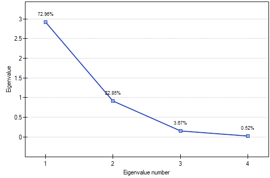
- Scree plot
The graph presents the pace of the decrease of eigenvalues, i.e. the percentage of explained variance.

\psline{-}(1,3.4)(2,1.9)
\psdot[dotsize=3pt](2,1.9)
\psline{-}(2,1.9)(3,1.7)
\psdot[dotsize=3pt](3,1.7)
\psline{-}(3,1.7)(4,0.5)
\psdot[dotsize=3pt](4,0.5)
\psline{-}(4,0.5)(5,0.4)
\psdot[dotsize=3pt](5,0.4)
\psline{-}(5,0.4)(6,0.3)
\psdot[dotsize=3pt](6,0.3)
\psline{-}(6,0.3)(7,0.22)
\psdot[dotsize=3pt](7,0.22)
\psline{-}(7,0.22)(8,0.15)
\psdot[dotsize=3pt](8,0.15)
\psline{-}(8,0.15)(9,0.11)
\psdot[dotsize=3pt](9,0.11)
\pscircle(4,0.5){0.15}
\psline[linestyle=dotted]{->}(6,2)(4.1,0.7)
\end{pspicture}](/lib/exe/fetch.php?media=wiki:latex:/imgc709912d291b7983f487ad7370a236dd.png "LaTeX")
The moment on the chart in which the process stabilizes and the decreasing line changes into a horizontal one is the so-called end of the scree (the end of sprinkling of the information about the original values carried by principal components). The components on the right from the point which ends the scree represent a very small variance and are, for the most part, random noise.
EXAMPLE cont. (iris.pqs file)
Defining principal components
When we have decided how many principal components we need we can start generating them. In the case of principal components created on the basis of a correlation matrix they are computed as a linear combination of standardized original values. If, however, principal components have been created on the basis of a covariance matrix, they are computed as a linear combination of eigenvalues which have been centralized with respect to the mean of the original values.
The obtained principal components constitute new variables with certain advantages. First of all, the variables are not collinear. Usually there are fewer of them than original variables, sometimes much fewer, and they carry the same or a slightly smaller amount of information than the original values. Thus, the variables can easily be used in most multidimensional analyses.
EXAMPLE cont. (iris.pqs file)
The advisability of using the Principal Component Analysis
If the variables are not correlated (the Pearson's correlation coefficient is near 0), then there is no use to conduct a principal component analysis, as in such a situation every variable is already a separate component.
Bartlett's test
The test is used to verify the hypothesis that the correlation coefficients between variables are zero (i.e. the correlation matrix is an identity matrix).
Hypotheses:

where:
– the variance matrix or covariance matrix of original variables ,
– the identity matrix (1 on the main axis, 0 outside of it).
The test statistic has the form presented below:

where:
– the number of original variables,
 – size (the number of cases),
 – th eigenvalue.
That statistic has, asymptotically (for large expected frequencies), the Chi-square distribution with  degrees of freedom.
The p-value, designated on the basis of the test statistic, is compared with the significance level  :
:

The Kaiser-Meyer-Olkin coefficient
The coefficient is used to check the degree of correlation of original variables, i.e. the strength of the evidence testifying to the relevance of conducting a principal component analysis.

 – the correlation coefficient between the th and the
  th variable,
 – the partial correlation coefficient between the th and the th variable.
The value of the Kaiser coefficient belongs to the range  where low values testify to the lack of a need to conduct a principal component analysis, and high values are a reason for conducting such an analysis.
That classical set of data was first published in Ronald Aylmer Fisher's 19361) work in which discriminant analysis was presented. The file contains the measurements (in centimeters) of the length and width of the petals and sepals for 3 species of irises. The studied species are setosa, versicolor, and virginica. It is interesting how the species can be distinguished on the basis of the obtained measurements.
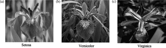
The photos are from scientific paper: Lee, et al. (2006r), „Application of a noisy data classification technique to determine the occurrence of flashover in compartment fires”
Principal component analysis will allow us to point to those measurements (the length and the width of the petals and sepals) which give the researcher the most information about the observed flowers.
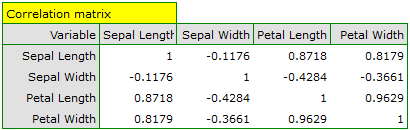
The first stage of work, done even before defining and analyzing principal components, is checking the advisability of conducting the analysis. We start, then, from defining a correlation matrix of the variables and analyzing the obtained correlations with the use of Bartlett's test and the KMO coefficient.
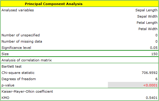
The p-value of Bartlett's statistics points to the truth of the hypothesis that there is a significant difference between the obtained correlation matrix and the identity matrix, i.e. that the data are strongly correlated. The obtained KMO coefficient is average and equals 0.54. We consider the indications for conducting a principal component analysis to be sufficient.
The first result of that analysis which merits our special attention are eigenvalues:
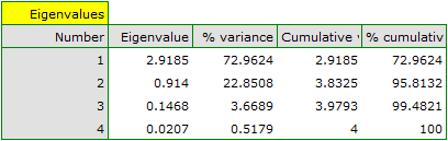
The obtained eigenvalues show that one or even two principal components will describe our data well. The eigenvalue of the first component is 2.92 and the percent of the explained variance is 72.96. The second component explains much less variance, i.e. 22.85%, and its eigenvalue is 9.91. According to Kaiser criterion, one principal component is enough for an interpretation, as only for the first principal component the eigenvalue is greater than 1. However, looking at the graph of the scree we can conclude that the decreasing line changes into a horizontal one only at the third principal component.
From that we may infer that the first two principal components carry important information. Together they explain a great part, as much as 95.81%, of the variance (see the cumulative % column).
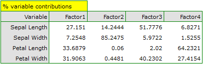
The communalities for the first principal component are high for all original variables except the variable of the width of the sepal, for which they equal 21.17%. That means that if we only interpret the first principal component, only a small part of the variable of the width of the sepal would be reflected.
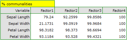
For the first two principal components the communalities are at a similar, very high level and they exceed 90% for each of the analyzed variables, which means that with the use of those components the variance of each variability is represented in over 90%.
In the light of all that knowledge it has been decided to separate and interpret 2 components.
In order to take a closer look at the relationship of principal components and original variables, that is the length and the width of the petals and sepals, we interpret: eigenvectors, factor loadings, and contributions of original variables.
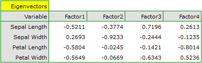
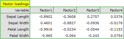
Particular original variables have differing effects on the first principal component. Let us put them in order according to that influence:
- The length of a petal is negatively correlated with the first component, i.e. the longer the petal, the lower the values of that component. The eigenvector of the length of the petal is the greatest in that component and equals -0.58. Its factor loading informs that the correlation between the first principal component and the length of the petal is very high and equals -0.99 which constitutes 33.69% of the first component;
- The width of the petal has an only slightly smaller influence on the first component and is also negatively correlated with it;
- We interpret the length of the sepal similarly to the two previous variables but its influence on the first component is smaller;
- The correlation of the width of the sepal and the first component is the weakest, and the sign of that correlation is positive.
The second component represents chiefly the original variable „sepal width”; the remaining original variables are reflected in it to a slight degree. The eigenvector, factor loading, and the contribution of the variable „sepal width” is the highest in the second component.
Each principal component defines a homogeneous group of original values. We will call the first component „petal size” as its most important variables are those which carry the information about the petal, although it has to be noted that the length of the sepal also has a significant influence on the value of that component. When interpreting we remember that the greater the values of that component, the smaller the petals.
We will call the second component „sepal width” as only the width of the sepal is reflected to a greater degree here. The greater the values of that component, the narrower the sepal.
Finally, we will generate the components by choosing, in the analysis window, the option: Add Principal Components. A part of the obtained result is presented below:
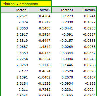
In order to be able to use the two initial components instead of the previous four original values, we copy and paste them into the data sheet. Now, the researcher can conduct the further statistics on two new, uncorrelated variables.
- [Analysis of the graphs of the two initial components]
The analysis of the graphs not only leads the researcher to the same conclusions as the analysis of the tables but will also give him or her the opportunity to evaluate the results more closely.
- [Factor loadings graph]
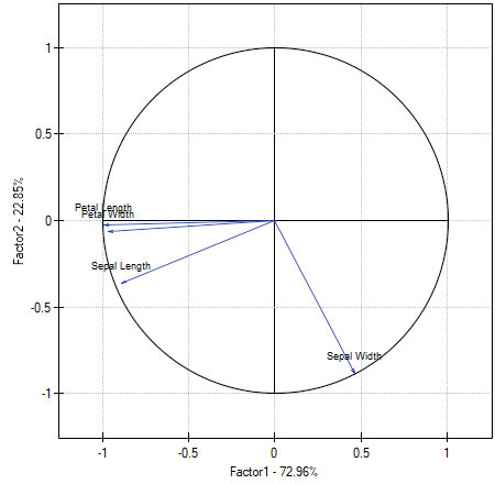
The graph shows the two first principal components which represent 72.96% of the variance and 22.85% of the variance, together amounting to 95.81% of the variance of original values
The vectors representing original values almost reach the rim of the unit circle (a circle with the radius of 1), which means they are all well represented by the two initial principal components which form the coordinate system.
The angle between the vectors illustrating the length of the petal, the width of the petal, and the length of the sepal is small, which means those variables are strongly correlated. The correlation of those variables with the components which form the system is negative, the vectors are in the third quadrant of the coordinate system. The observed values of the coordinates of the vector are higher for the first component than for the second one. Such a placement of vectors indicates that they comprise a uniform group which is represented mainly by the first component.
The vector of the width of the sepal points to an entirely different direction. It is only slightly correlated with the remaining original values, which is shown by the inclination angle with respect to the remaining original values – it is nearly a right angle. The correlation of that vector with the first component is positive and not very high (the low value of the first coordinate of the terminal point of the vector), and it is negative and high (the high value of the second coordinate of the terminal point of the vector) in the case of the second component. From that we may infer that the width of the sepal is the only original variable which is well represented by the second component.
- [Biplot]
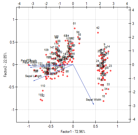
The biplot presents two series of data spread over the first two components. One series are the vectors of original values which have been presented on the previous graph and the other series are the points which carry the information about particular flowers. The values of the second series are read on the upper axis  and the right axis
  . The manner of interpretation of vectors, that is the first series, has been discussed with the previous graph. In order to understand the interpretation of points let us focus on flowers number 33, 34, and 109.
Flowers number 33 and 34 are similar – the distance between points 33 and 34 is small. For both points the value of the first component is much greater than the average and the value of the second component is much smaller than the average. The average value, i.e. the arithmetic mean of both components, is 0, i.e. it is the middle of the coordination system. Remembering that the first component is mainly the size of the petals and the second one is mainly the width of the sepal we can say that flowers number 33 and 34 have small petals and a large width of the sepal. Flower number 109 is represented by a point which is at a large distance from the other two points. It is a flower with a negative first component and a positive, although not high second component. That means the flower has relatively large petals while the width of the sepal is a bit smaller than average.
Similar information can be gathered by projecting the points onto the lines which extend the vectors of original values. For example, flower 33 has a large width of the sepal (high and positive values on the projection onto the original value „sepal width”) but small values of the remaining original values (negative values on the projection onto the extension of the vectors illustrating the remaining original values).
Cluster Analysis
Cluster analysis is a series of methods for dividing objects or features (variables) into similar groups. In general, these methods are divided into two classes: hierarchical methods and non-hierarchical methods such as the k-means method. In their algorithms, both methods use a similarity matrix to create clusters based on it.
Object grouping and variable grouping are done in cluster analysis in exactly the same way. In this chapter, clustering methods will be explained using object clustering as an example.
Note!
In order to ensure balanced influence of all variables on similarity matrix elements, data should be standardized by choosing appropriate option in the analysis window. Lack of standardization gives more influence on obtained result to variables expressed with higher numbers.
Hierarchical methods
Hierarchical cluster analysis methods involve building a hierarchy of clusters, starting from the smallest (consisting of single objects) and ending with the largest (consisting of the maximum number of objects). Clusters are created on the basis of object similarity matrix.
AGGLOMERATION PROCEDURE
- By following the indicated linkage method, the algorithm finds a pair of similar objects in the similarity matrix and combines them into a cluster;
- The dimension of the similarity matrix is reduced by one (two objects are replaced by one) and the distances in the matrix are recalculated;
- Steps 2-3 are repeated until a single cluster containing all objects is obtained.
Object similarity
In the process of working with cluster analysis, similarity or distance measures play an essential role. The mutual similarity of objects is placed in the similarity matrix. A large variety of methods for determining the distance/similarity between objects allows to choose such measures that best reflect the actual relation. Distance and similarity measures are described in more detail in the section similarity matrix. Cluster analysis is based on finding clusters inside a similarity matrix. Such a matrix is created in the course of performing cluster analysis. For the cluster analysis to be successful, it is important to remember that higher values in the similarity matrix should indicate greater variation of objects, and lower values should indicate their similarity.
Note!
To increase the influence of the selected variables on the elements of the similarity matrix, indicate the appropriate weights when defining the distance while remembering to standardize the data.
For example, for people wanting to take care of a dog, grouping dogs according to size, coat, tail length, character, breed, etc. will make the choice easier. However, treating all characteristics identically may put completely dissimilar dogs into one group. For most of us, on the other hand, size and character are more important than tail length, so the similarity measures should be set so that size and character are most important in creating clusters.
Object and cluster linkage methods
- Single linkage method - the distance between clusters is determined by the distance of those objects of each cluster that are closest to each other.
{2}
\psdot[dotstyle=*](-.8,1)
\psdot[dotstyle=*](1.7,0.1)
\psdot[dotstyle=*](0.6,1.2)
\pscircle[linewidth=2pt](6,.5){2}
\psdot[dotstyle=*](7.2,1.2)
\psdot[dotstyle=*](5.1,-0.4)
\psdot[dotstyle=*](5.6,1.3)
\psline{-}(1.7,0.1)(5.1,-0.4)
\end{pspicture}](/lib/exe/fetch.php?media=wiki:latex:/imge1a5de3e36c331f92bb1ddd197ffcc63.png "LaTeX")
- Complete linkage method - the distance between clusters is determined by the distance of those objects of each cluster that are farthest apart.
{2}
\psdot[dotstyle=*](-.8,1)
\psdot[dotstyle=*](1.7,0.1)
\psdot[dotstyle=*](0.6,1.2)
\pscircle[linewidth=2pt](6,.5){2}
\psdot[dotstyle=*](7.2,1.2)
\psdot[dotstyle=*](5.1,-0.4)
\psdot[dotstyle=*](5.6,1.3)
\psline{-}(-.8,1)(7.2,1.2)
\end{pspicture}](/lib/exe/fetch.php?media=wiki:latex:/imgd86738754d560f3b0b517c3b97807da1.png "LaTeX")
- Unweighted pair-group method using arithmetic averages - the distance between clusters is determined by the average distance between all pairs of objects located within two different clusters.
{2}
\psdot[dotstyle=*](-.8,1)
\psdot[dotstyle=*](1.7,0.1)
\psdot[dotstyle=*](0.6,1.2)
\pscircle[linewidth=2pt](6,.5){2}
\psdot[dotstyle=*](7.2,1.2)
\psdot[dotstyle=*](5.1,-0.4)
\psdot[dotstyle=*](5.6,1.3)
\psline{-}(-.8,1)(7.2,1.2)
\psline{-}(-.8,1)(5.1,-0.4)
\psline{-}(-.8,1)(5.6,1.3)
\psline{-}(1.7,0.1)(7.2,1.2)
\psline{-}(1.7,0.1)(5.1,-0.4)
\psline{-}(1.7,0.1)(5.6,1.3)
\psline{-}(0.6,1.2)(7.2,1.2)
\psline{-}(0.6,1.2)(5.1,-0.4)
\psline{-}(1.7,0.1)(5.6,1.3)
\end{pspicture}](/lib/exe/fetch.php?media=wiki:latex:/img74722956ba453f9c18004ab4885a71f4.png "LaTeX")
- Weighted pair-group metod using arithmetic averages - similarly to the unweighted pair-group method using arithmetic averages method it involves calculating the average distance, but this average is weighted by the number of elements in each cluster. As a result, we should choose this method when we expect to get clusters with similar sizes.
- Ward's method - is based on the variance analysis concept - it calculates the difference between the sums of squares of deviations of distances of individual objects from the center of gravity of clusters, to which these objects belong. This method is most often chosen due to its quite universal character.
{2}
\psdot[dotstyle=*](-.8,1)
\psdot[dotstyle=*](1.7,0.1)
\psdot[dotstyle=*](0.6,1.2)
\psline[linestyle=dashed]{-}(-.8,1)(0.52,0.8)
\psline[linestyle=dashed]{-}(1.7,0.1)(0.52,0.8)
\psline[linestyle=dashed]{-}(0.6,1.2)(0.52,0.8)
\psdot[dotstyle=pentagon*,linecolor=red](0.52,0.8)
\pscircle[linewidth=2pt](6,.5){2}
\psdot[dotstyle=*](7.2,1.2)
\psdot[dotstyle=*](5.1,-0.4)
\psdot[dotstyle=*](5.6,1.3)
\psdot[dotstyle=pentagon*,linecolor=red](5.85,0.8)
\psline[linestyle=dashed]{-}(7.2,1.2)(5.85,0.8)
\psline[linestyle=dashed]{-}(5.1,-0.4)(5.85,0.8)
\psline[linestyle=dashed]{-}(5.6,1.3)(5.85,0.8)
\psline[linestyle=dotted]{-}(0.52,0.8)(5.85,0.8)
\psline[linestyle=dotted]{-}(-.8,1)(7.2,1.2)
\psline[linestyle=dotted]{-}(-.8,1)(5.1,-0.4)
\psline[linestyle=dotted]{-}(-.8,1)(5.6,1.3)
\psline[linestyle=dotted]{-}(1.7,0.1)(7.2,1.2)
\psline[linestyle=dotted]{-}(1.7,0.1)(5.1,-0.4)
\psline[linestyle=dotted]{-}(1.7,0.1)(5.6,1.3)
\psline[linestyle=dotted]{-}(0.6,1.2)(7.2,1.2)
\psline[linestyle=dotted]{-}(0.6,1.2)(5.1,-0.4)
\psline[linestyle=dotted]{-}(1.7,0.1)(5.6,1.3)
\end{pspicture}](/lib/exe/fetch.php?media=wiki:latex:/img169789b519f1a291561b77a1301c7fc1.png "LaTeX")
The result of a cluster analysis conducted using the hierarchical method is represented using a dendogram. A Dendogram is a form of a tree indicating the relations between particular objects obtained from the similarity matrix analysis. The cutoff level of the dendogram determines the number of clusters into which we want to divide the collected objects. The choice of the cutoff is determined by specifying the length of the bond at which the cutoff will occur as a percentage, where 100\% is the length of the last and also the longest bond in the dendogram.
Settings window of the hierarchical cluster analysis is opened via menu Advanced Statistics→Reduction and grouping→Hierarchical Cluster Analysis.
EXAMPLE cont. (iris.pqs file)
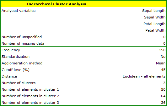
The analysis will be performed on the classic data set of dividing iris flowers into 3 varieties based on the width and length of the petals and sepal sepals (R.A. Fisher 19362)). Because this data set contains information about the actual variety of each flower, after performing a cluster analysis it is possible to determine the accuracy of the division made.
We assign flowers to particular groups on the basis of columns from 2 to 5. We choose the way of calculating distances e.g. Euclidean distance and the linkage method. Specifying the cutoff level of clusters will allow us to cut off the dendogram in such a way that clusters will be formed - in the case of this analysis we want to get 3 clusters and to achieve this we change the cutoff level to 45. We will also attach data+clusters to the report..
In the dendogram, the order of the bonds and their lengths are shown.
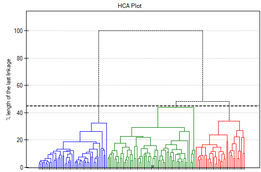
To examine whether the extracted clusters represent the 3 actual varieties of iris flowers, we can copy the column containing the information about cluster belonging from the report and paste it into the datasheet. Like the clusters, the varieties are also described numerically by Codes/Labels/Format, so we can easily perform a concordance analysis. We will check the concordance of our results with the actual belonging of a given flower to the corresponding species using the Cohen's Kappa method .
For this example, the observed concordance is shown in the table:
We conclude from it that the virginica variety can be confused with the versicolor variety, hence we observe 14 misclassifications. However, the Kappa concordance coefficient is statistically significant at 0.86, indicating that the clusters obtained are highly consistent with the actual flower variety.
K-means method
K-means method is based on an algorithm initially proposed by Stuart Lloyd and published in 1982 3). In this method, objects are divided into a predetermined number of clusters. The initial clusters are adjusted during the agglomeration procedure by moving objects between them so that the variation of objects within the cluster is as small as possible and the cluster distances are as large as possible. The algorithm works on the basis of the matrix of Euclidean distances between objects, and the parameters necessary in the procedure of agglomeration of the k-means method are: starting centers and stopping criterion. The starting centers are the objects from which the algorithm will start building clusters, and the stopping criterion is the definition of how to stop the algorithm.
AGGLOMERATION PROCEDURE
- Selection of starting centers
- Based on the similarity matrix, the algorithm assigns each object to the nearest center
- For the clusters obtained, the adjusted centers are determined.
- Steps 2-3 are repeated until the stop criterion is met.
Starting centers
The choice of starting centers has a major impact on the convergence of the k-means algorithm for obtaining appropriate clusters. The starting centers can be selected in two ways:
- k-means++ - is the optimal selection of starting points by using the k-means++ algorithm proposed in 2007 by David Arthur and Sergei Vassilvitskii 4). It ensures that the optimal solution of the k-means algorithm is obtained with as few iterations as possible. The algorithm uses an element of randomness in its operation, so the results obtained may vary slightly with successive runs of the analysis. If the data do not form into natural clusters, or if the data cannot be effectively divided into disconnected clusters, using k-means++ will result in completely different results in subsequent runs of the k-means analysis. High reproducibility of the results, on the other hand, demonstrates the possibility of good division into separable clusters.
- n firsts - allows the user to indicate points that are start centers by placing these objects in the first positions in the data table.
Stop criterion is the moment when the belonging of the points to the classes does not change or the number of iterations of steps 2 and 3 of the algorithm reaches a user-specified number of iterations.
Because of the way the k-means cluster analysis algorithm works, a natural consequence of it is to compare the resulting clusters using a one-way analysis of variance (**ANOVA**) for independent groups.
Settings window of the k-means cluster analysis is opened via menu Advanced Statistics→Reduction and grouping→K-means cluster analysis.
EXAMPLE cont. (iris.pqs file)
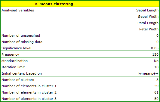
The analysis will be performed on the classic data set of dividing iris flowers into 3 varieties based on the width and length of the petals and sepal sepals (R.A. Fisher 19365)).
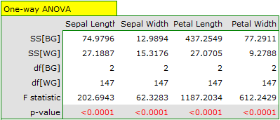
We assign flowers to particular groups on the basis of columns from 2 to 5. We also indicate that we want to divide the flowers into 3 groups. As a result of the analysis, 3 clusters were formed, which differed statistically significantly in each of the examined dimensions (ANOVA results), i.e. petal width, petal length, sepal width as well as sepal length.
The difference can be observed in the graphs where we show the belonging of each point to a cluster in the two dimensions selected:
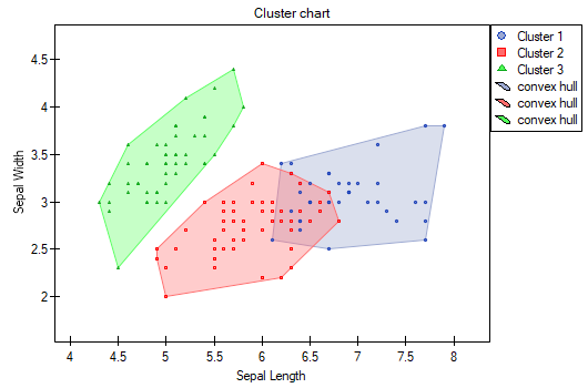
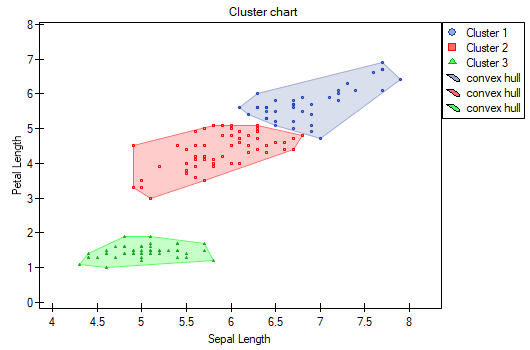
By repeating the analysis we may get slightly different results, but the variation obtained will not be large. It proves that data subjected to analysis form natural clusters and conducting a cluster analysis is justified in this case.
Note no.1!
After running the analysis a few times, we can select the result we are most interested in, and then set those data that are the starting centers at the beginning of the worksheet - then the analysis performed based on the starting centers selected as N first observations will consistently produce that result we selected.
Note no.2!
To find out if the clusters represent the 3 actual varieties of iris flowers, we can copy the information about belonging to a cluster from the report and paste it into the datasheet. We can check the consistency of our results with the actual affiliation of a given flower to the corresponding variety in the same way as for the hierarchical cluster analysis.
1)
, 2)
, 5)
Fisher R.A. (1936), The use of multiple measurements in taxonomic problems. Annals of Eugenics 7 (2): 179–188
3)
Lloyd S. P. (1982), Least squares quantization in PCM. IEEE Transactions on Information Theory 28 (2): 129–137
4)
Arthur D., Vassilvitskii S. (2007), k-means++: the advantages of careful seeding. Proceedings of the eighteenth annual ACM-SIAM symposium on Discrete algorithms. Society for Industrial and Applied Mathematics Philadelphia, PA, USA. 1027–1035
en/statpqpl/redpl.txt · ostatnio zmienione: 2022/02/16 09:09 przez admin
Narzędzia strony
Wszystkie treści w tym wiki, którym nie przyporządkowano licencji, podlegają licencji: CC Attribution-Noncommercial-Share Alike 4.0 International
