Narzędzia użytkownika
Narzędzia witryny
Pasek boczny
en:statpqpl:wielowympl:logistpl:wykresy
Graphs in logistic regression
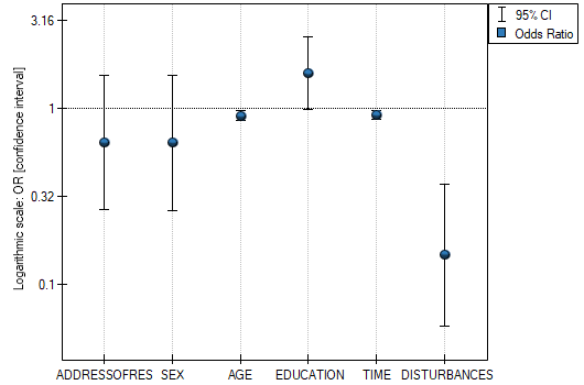
- Odds Ratio with confidence interval – is a graph showing the OR along with the 95 percent confidence interval for the score of each variable returned in the constructed model. For categorical variables, the line at level 1 indicates the odds ratio value for the reference category.
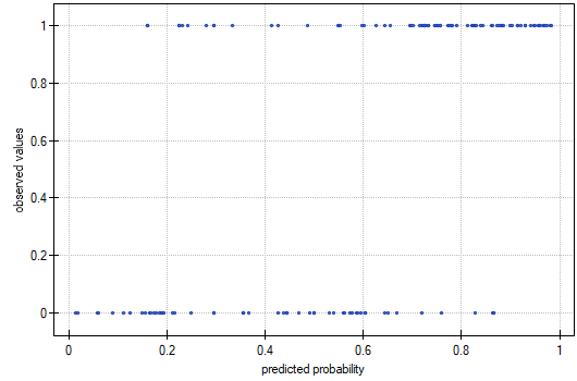
- Observed Values / Expected Probability – is a graph showing the results of each person's predicted probability of an event occurring (X-axis) and the true value, which is the occurrence of the event (value 1 on the Y-axis) or the absence of the event (value 0 on the Y-axis). If the model predicts very well, points will accumulate at the bottom near the left side of the graph and at the top near the right side of the graph.
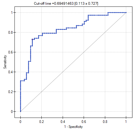
- ROC curve – is a graph constructed based on the value of the dependent variable and the predicted probability of an event.
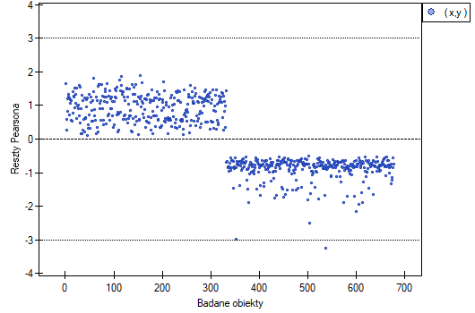
- Pearson residuals plot – is a graph that allows you to assess whether there are outliers in the data. The residuals are the differences between the observed value and the probability predicted by the model. Plots of raw residuals from logistic regression are difficult to interpret, so they are unified by determining Pearson residuals. The Pearson residual is the raw residual divided by the square root of the variance function. The sign (positive or negative) indicates whether the observed value is higher or lower than the value fitted to the model, and the magnitude indicates the degree of deviation. Person's residuals less than or greater than 3 suggest that the variance of a given object is too largeu.
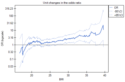
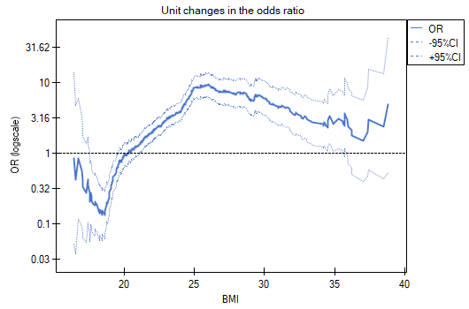
- Unit changes in the odds ratio – is a graph showing a series of odds ratios, along with a confidence interval, determined for each possible cut-off point of a variable placed on the X axis. It allows the user to select one good cut-off point and then build from that a new bivariate variable at which a high or low odds ratio is achieved, respectively. The chart is dedicated to the evaluation of continuous variables in univariate analysis, i.e. when only one independent variable is selected.
- odds ratio profile is a graph presenting series of odds ratios with confidence interval, determined for a given window size, i.e. comparing frequencies inside the window with frequencies placed outside the window. It enables the user to choose several categories into which he wants to divide the examined variable and adopt the most advantageous reference category. It works best when we are looking for a U-shaped function i.e. high risk at low and at high values of the variable under study and low risk at average values. There is no one window size that is good for every analysis, the window size must be determined individually for each variable. The size of the window indicates the number of unique values of variable X contained in the window. The wider the window, the greater the generalizability of the results and the smoother the odds ratio function. The narrower the window, the more detailed the results, resulting in a more lopsided odds ratio function. A curve is added to the graph showing the smoothed (Lowess method) odds ratio value. Setting the smoothing factor close to 0 results in a curve closely fitting to the odds ratio, whereas setting the smoothing factor closer to 1 results in more generalized odds ratio, i.e. smoother and less fitting to the odds ratio curve. The graph is dedicated to the evaluation of continuous variables in univariate analysis, i.e. when only one independent variable is selected.
EXAMPLE (OR profiles.pqs file)
We examine the risk of disease A and disease B as a function of the patient's BMI. Since BMI is a continuous variable, its inclusion in the model results in a unit odds ratio that determines a linear trend of increasing or decreasing risk. We do not know whether a linear model will be a good model for the analysis of this risk, so before building multivariate logistic regression models, we will build some univariate models presenting this variable in graphs to be able to assess the shape of the relationship under study and, based on this, decide how we should prepare the variable for analysis. For this purpose, we will use plots of unit changes in odds ratio and odds ratio profiles, and for the profiles we will choose a window size of 100 because almost every patient has a different BMI, so about 100 patients will be in each window.
- Disease A
Unit changes in the odds ratio show that when the BMI cut-off point is chosen somewhere between 27 and 37, we get a statistically significant and positive odds ratio showing that people with a BMI above this value have a significantly higher risk of disease than people below this value.
The odds ratio profiles show that the red curve is still close to 1, only the top of the curve is slightly higher, indicating that it may be difficult to divide BMI into more than 2 categories and select a good reference category, i.e., one that yields significant odds ratios.
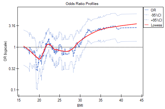
In summary, one can use a split of BMI into two values (e.g., relate those with a BMI above 30 to those with a BMI below that, in which case OR[95%CI]=[1.41, 4.90], p=0.0024) or stay with the unit odds ratio, indicating a constant increase in disease risk with an increase in BMI of one unit (OR[95%CI]=1.07[1.02, 1.13], p=0.0052).
- Disease B
Unit changes in the odds ratio show that when the BMI cut-off point is chosen somewhere between 22 and 35, we get a statistically significant and positive odds ratio showing that people with a BMI above this value have a significantly higher risk of disease than those below this value.
The odds ratio profiles show that it would be much better to divide BMI into 2 or 4 categories. With the reference category being the one that includes a BMI somewhere between 19 and 25, as this is the category that is lowest and is far removed from the results for BMIs to the left and right of this range. We see a distinct U-like shape, meaning that disease risk is high at low BMI and at high BMI.
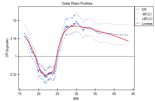
In summary, although the relationship for the unit odds ratio, or linear relationship, is statistically significant, it is not worth building such a model. It is much better to divide BMI into categories. The division that best shows the shape of this relationship is the one using two or three BMI categories, where the reference value will be the average BMI. Using the standard division of BMI and establishing a reference category of BMI in the normal range will result in a more than 15 times higher risk for underweight people (OR[95%CI]=15.14[6.93, 33.10]) more than 10 times for overweight people (OR[95%CI]=10.35[6.74, 15.90]) and more than twelve times for people with obesity (OR[95%CI]=12.22[6.94, 21.49]).
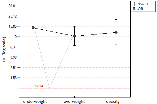
In the odds ratio plot, the BMI norm is indicated at level 1, as the reference category. We have drawn lines connecting the obtained ORs and also the norm, so as to show that the obtained shape of the relationship is the same as that determined previously by the odds ratio profile.
en/statpqpl/wielowympl/logistpl/wykresy.txt · ostatnio zmienione: 2022/02/15 20:11 przez admin
Narzędzia strony
Wszystkie treści w tym wiki, którym nie przyporządkowano licencji, podlegają licencji: CC Attribution-Noncommercial-Share Alike 4.0 International
