Narzędzia użytkownika
Narzędzia witryny
Pasek boczny
en:statpqpl:survpl:wsteppl:kmpl
Kaplan-Meier curves
Kaplan-Meier curves allow the evaluation of the survival time without the need to arbitrarily group the observations like in the case of life tables. The estimator was introduced by Kaplan and Meier (1958)\cite{kaplan}.
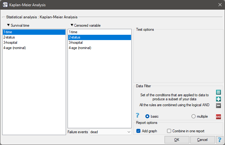
The window with settings for Kaplan-Meier curve is accessed via the menu Advanced statistics→Survival analysis→Kaplan-Meier Analysis
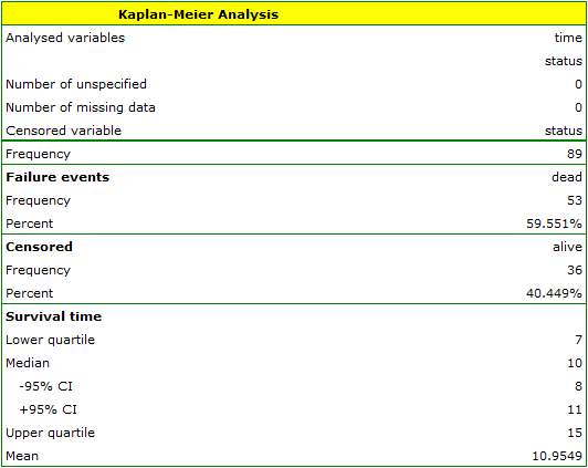
As with survival tables we calculate the survival function, i.e. the probability of survival until a certain time. The graph of the Kaplan-Meier survival function is created by a step function. Based on the standard error (Greenwood formula) and the logarithmic transformation (log-log), confidence intervals around this curve are constructed. The point of time at which the value of the function is 0.5 is the survival time median. The median indicates 50% risk of mortality, it means we can expect that half of the patients will die within a specific time. Both the median and other percentiles are determined as the shortest survival time for which the survival function is smaller or equal to a given percentile. For the median, a confidence interval is determined based on the test-based method by Brookmeyer and Crowley (1982)\cite{brookmeyer}. The survival time mean is determined as the field under the survival curve.
The data concerning the survival time are usually very heavily skewed so in the survival analysis the median is a better measure of the central tendency than the mean.
We present the survival time after a liver transplantation, with the use of the Kaplan-Meier curve
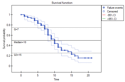
The survival function does not suddenly plunge right after the transplantation. Therefore, we conclude that the initial period after the transplantation does not carry a particular risk of death. The value of the median shows that within 10 years after the transplant, we expect that half of the patients will die. The value is marked on the graph by drawing a line in point 0.5 which signifies the median. In a similar manner we mark the quartiles in the graph.
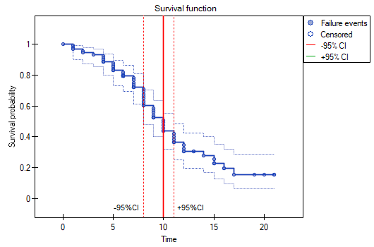
We can visualize the confidence interval for the median on a graph by drawing vertical lines based on the confidence interval around the curve and lines at the 0.5 level.
en/statpqpl/survpl/wsteppl/kmpl.txt · ostatnio zmienione: 2022/02/16 09:45 przez admin
Narzędzia strony
Wszystkie treści w tym wiki, którym nie przyporządkowano licencji, podlegają licencji: CC Attribution-Noncommercial-Share Alike 4.0 International
