Narzędzia użytkownika
Narzędzia witryny
Pasek boczny
en:przestrzenpl:opisowepl:opispl
Descriptive statistics of points
To conduct Descriptive Statistics on the basis of a Map data we should have at our disposal a point, multipoint, or polygonal file. In the case of an analysis of a polygonal file, calculations are based on centroids of polygons, and in the case of a multipoint file they are based on centers of objects.
Boundaries of an area in which analysed points are enclosed can be defined, depending on a particular need, with the help of: a convex hull, the smallest rectangle, a rectangle from from layer bounding, or the smallest circle. The studied area can also be defined only with the use of the size of its area.
The distance between the points is measured with the Euclidean metric.
The basic statistics made for point analysis:
 – the area of a studied region,
 – the size of a sample, i.e. the number of points lying within the studied region,
 – density,
- descriptive statistics of the distance matrix between points:
- arithmetic mean with confidence interval,
- standard deviation,
- median,
- quartiles,
- minimum and maximum.
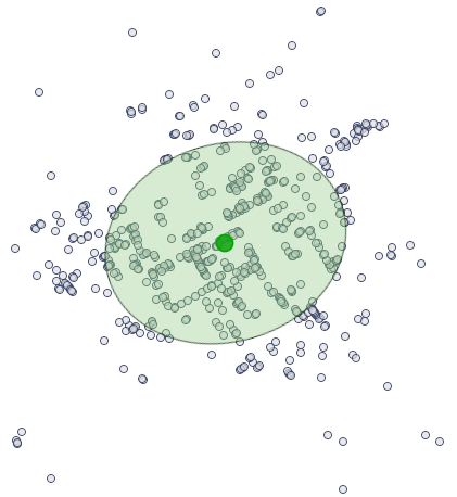
The analysis also gives a graph pertaining to a distance matrix and layers which can be drawn on the surface of a map. Layers pertain to centrographic measures: the measure of central tendency and the measure of dispersion:
- The center of point distribution: the mean of coordinates of the
 axis and the
  axis (
 ,
,  ),
), - The area of standard deviations, built around the center, defined by:
- Circle
The radius of the circle is  – standard distance from the center ( standard distance deviation) expressed with the formula:

where:
 ,
,
 .
.
- Ellipse
The angle of the inclination of an ellipse axis (Y) with respect to the coordinate system (OY axis) is expressed with the formula:

where:
 ,
,
 ,
,
 .
.
The lengths of the semiaxes of an ellipse:


- Rectangle
The lengths of rectangle sides are:  ,
,  , where
  and
and  are standard deviations for the coordinates of the and axes
After the weights for particular objects have been defined, we calculate the weighted center of point distribution and the weighted circle representing the standard deviation area.
are standard deviations for the coordinates of the and axes
After the weights for particular objects have been defined, we calculate the weighted center of point distribution and the weighted circle representing the standard deviation area.
- The weighted center of point distribution: the weighted mean of coordinates of the axis and the axis:

where:
 – weights representing the value of a feature in the
  th object.
- Weighted circle
 – weighted standard distance from the center expressed with the formula:

 ,
,
 .
.
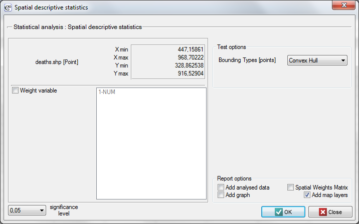
The window with settings for Descriptive statistics is accessed via the menu Spacial analysis → Spatial descriptive statistics.
EXAMPLE (directory: snow, SHP files: deaths, pumps, streets)
Data for the analysis are probably the best known, classical example of the use of cartography in epidemiology. They present the epidemic of cholera in London in 1854. The map which presents the range of the epidemic was made by John Snow, a doctor and the discoverer of the cause of the epidemic, considered to be one of the founders of epidemiology. The coordinates of points which constituted the basis for drawing the maps come from the original John Snow's map which was digitalized by Rusty Dodson from the US National Center for Geographic Information Analysis (http://ncgia.ucsb.edu/Publications/Software/cholera/) and later presented in meters.
- The map
deathscontains information about the location of 578 points (deaths due to cholera) in Soho – a London district. - The map
pumpscontains information about the location of 13 points (water pumps) in Soho. - The map
streetscontains information about the location of lines (streets) in Soho.
After importing the above shapefiles (SHP) we can view and edit each of them in the Map manager.
To conduct an analysis we select the deaths map and perform the Spatial descriptive statistics. Because we will utilize the map coordinates as data for the analysis, in the descriptive statistics window we select the option Use points from map coordinates and, as the bounding type, we select the Convex Hull.
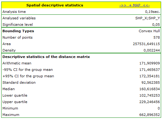
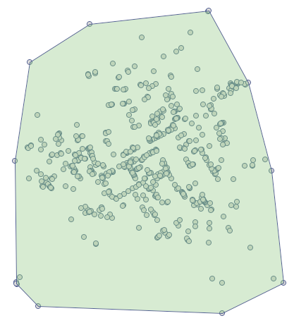
The area in which there are the points (defined by the convex hull) is  . We can draw them on the map by pressing the button
  and selecting the layer of object bounding.
There is on average over 2 points per  (density=
 points per
  ).
).
The analysis of the point distance matrix allows a more exact evaluation of their density. Some points are in the same place because the smallest distance is  . There are also points at a far greater distance from each other – the greatest distance is
  . We can also find information about the average distance and the standard deviation of the points here.
The most interesting information in the analysis of the deaths map is offered by the localized Center of point distribution ( ,
,  ), together with the area of standard deviations which describe the the degree of concentration and the direction of dispersion (circle, ellipse, rectangle).
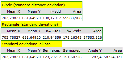
The ellipse of standard deviations and the Center is drawn again by moving on to the map manager (on the layer list we uncheck the bounding).
As a result of conversations with local people, Snow suspected that water could have been the source of the epidemic. When the three maps are joined we can identify the water pump the water from which turned out to be the cause of the epidemic. To find it we should first display the streets map in the Map Manager and next we should overlay the deaths map and the pumps onto it by pressing the button  .
.
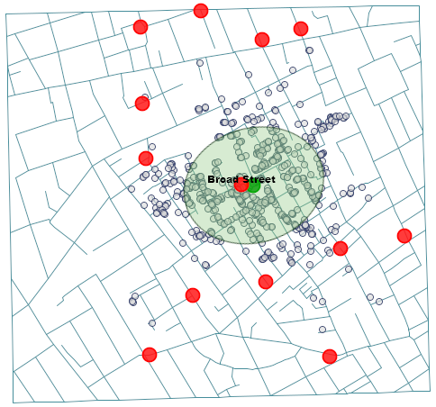
The source of the epidemic turned out to be the water pump on the Broad Street (we can display its label in the Map Manager). That is the only pump which was in the selected elliptical area, and its location (678.85, 633.27) and the location of the middle of the ellipse (, ), i.e. the place around which the deaths centered, are very close to each other.
1)
Buliung R.N., Remmel T.K. (2008), Open source, spatial analysis, and activity-travel behaviour research: capabilities of the aspace package. Journal of Geographical Systems 10, 191-216
2)
De Smith M.J., Goodchild M.F., Longley P.A. (2007) , Geospatial Analysis, A Comprehensive Guide to Principles, Techniques and Software Tools (2nd ed). Matador
en/przestrzenpl/opisowepl/opispl.txt · ostatnio zmienione: 2022/02/16 12:59 przez admin
Narzędzia strony
Wszystkie treści w tym wiki, którym nie przyporządkowano licencji, podlegają licencji: CC Attribution-Noncommercial-Share Alike 4.0 International
