Narzędzia użytkownika
Narzędzia witryny
Pasek boczny
en:statpqpl:aopisowapl:tabliczpl:tablpl
Frequency tables and empirical distribution of the data
The basis of statistical research is the determination of the empirical distribution, i.e., the distribution of a feature observed in a sample. The empirical distribution is determined by assigning a frequency of occurrence to successive values of the feature. Such distribution can be presented in the form of frequency table or as a graph (histogram). For small data sets, frequency tables can present all data - the so-called point distribution series, while for larger data sets the so-called interval distribution series are created.
To represent the data distribution in table form, bring up the Frequency tables window by selecting menu Statistics→Descriptive analysis→Frequency tables.
In this window we choose a variable to analyse and options for analysis. You can sort the output as a text or as a number by selecting the appropriate options. If there are empty cells in the analysed column, they may be included or omitted in the analysis. The result of analysis will be placed in report attached to datasheet, for which analysis has been done.
In addition, if you want the data to be visualized with a column chart or histogram, then in the Frequency table window, check the Add graph option..
EXAMPLE (distribution.pqs file)
A mobile operator conducts a series of surveys on how customers use the number of „free minutes” they are given in their subscription. Customers can use up to 190 such minutes each month. The study was based on a random sample of 200 customers. Information analysed included:
- type of subscription purchased,
- number of free minutes used,
- number of subscriptions registered for a given customer (does not apply to companies).
We want to present the distribution of:
- type of subscription,
- number of free minutes used,
- number of registered subscriptions for an individual person.
Open the Frequency table window..
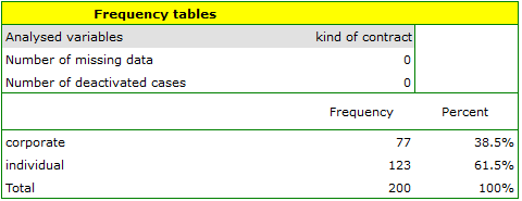
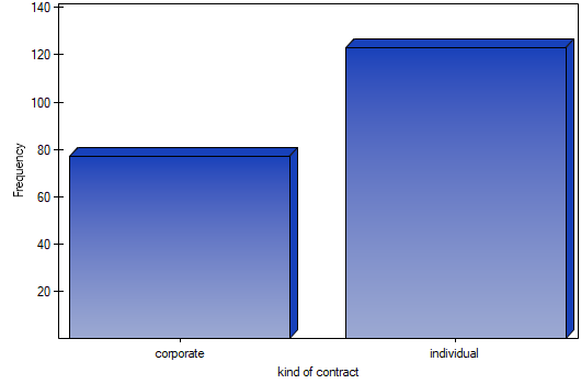
- Select the
Variableto analyse: „type of subscription” andAdd graph. Then confirm the selected settings withOKbutton and the result is obtained as a report:
- Resume Analysis by pressing
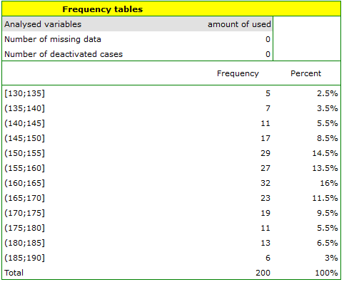
 . We select the
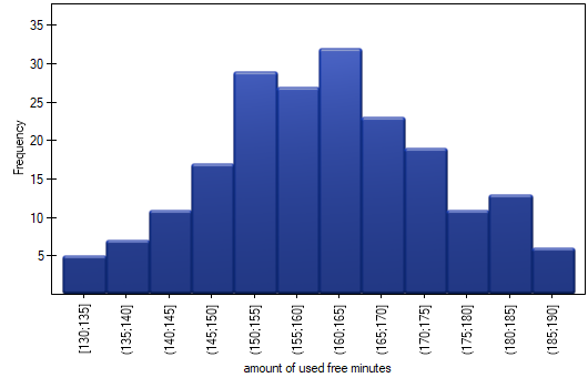
 variableto analyse: „amount of used free minutes” and check the optionIntervals (classes), setstart valuefor example to 130 andstepto 5. We can also check the optionAdd graph. Then confirm the selected options withOKand the result is obtained as a report:
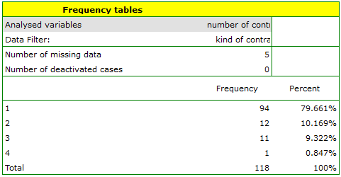
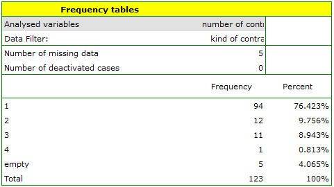
- Resume Analysis by pressing. We set filter so that the analysis is performed only for individuals. We select the
variableto analyse: „Number of subscriptions”. Since this variable also contains missing data, the result obtained may or may not include these missing cases in the analysis, depending on the option selected:
EXAMPLE (fertiliser.pqs file)
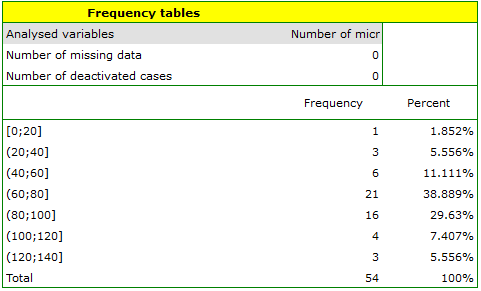
An experiment was conducted to study the microbiological condition of soil under perennial ryegrass cultivation supplied with biologically active fertilizers. Soils were fertilized with different types of microbial preparations and fertilizers and then the number of microorganisms present per gram of soil dry matter was calculated. We want to know the frequency of actinomycetes per 1 gram of dry nitrogen fertilized soil. We are interested in how often 0 to 20 actinomycetes were present in the sample, more than 20 to 40 actinomycetes, more than 40 to 60 actinomycetes, etc. We select only the first 54 rows in the datasheet that match the assumptions of the analysis (these are nitrogen-fertilized actinomycetes) and open the Frequency Tables.
In the options window, we select the variable to be analysed: Number of microorganisms, and then set the class intervals so that the start value is 0 and the step is 20. You should see a message at the top of the window: \textcolor{black}{
Data limited by selection
. Confirm the selection with the OK button and the result should appear as a report:
en/statpqpl/aopisowapl/tabliczpl/tablpl.txt · ostatnio zmienione: 2022/02/11 17:40 przez admin
Narzędzia strony
Wszystkie treści w tym wiki, którym nie przyporządkowano licencji, podlegają licencji: CC Attribution-Noncommercial-Share Alike 4.0 International
