Correlation matrix
When we are interested in correlation between many variables, a convenient way to visualize it is to present correlation coefficients in the form of a chart. Depending on the scale on which the data was collected, in PQStat we have a choice of these coefficients:
- r-Pearson (interval scale)
- r-Spearman (ordinal scale or stronger)
- tau-Kendall (ordinal scale or stronger)
- C-Pearson (nominal scale or stronger)
- V-Cramer (nominal scale or stronger)
- Phi (nominal scale or stronger)
- Q-Yule (nominal scale or stronger)
As a result of the analysis two matrices are created, i.e. a matrix of correlation coefficients and a matrix of p-values for the test determining the statistical significance of a given coefficient (for r-Pearson, r-Spearman and tau-Kendall coefficients these were the tests dedicated for them, for nominal scale in was the chi-square test ). In the matrix of correlation coefficients , at the intersection of two variables, the coefficient of their correlation is given, and its p-value is in the corresponding place in the other matrix. The cell color in the coefficient matrix is graded from blue (negative coefficients) to red (positive coefficients).
The analysis determines the correlation for each pair of variables, so missing data are omitted in pairs. If we want to perform the analysis by omitting missing data in other variables (i.e., not those included in the pair), then we should do so by using advanced filter.
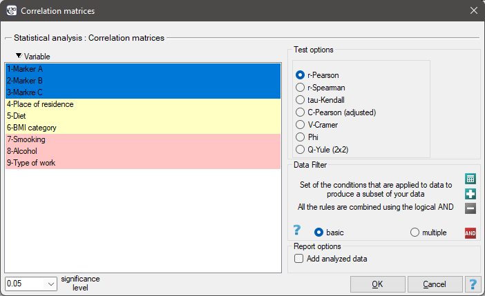
The window with correlation matrix settings is opened via
Statistics→Calculators→Correlation matrices
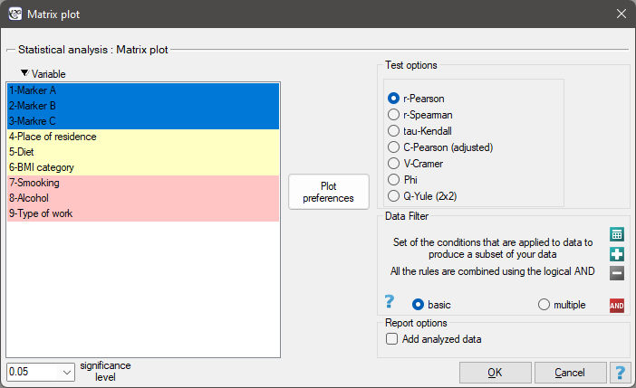
The window with settings for the matrix plot for the correlation matrix is opened via Plots→Matrix plot
EXAMPLE (markers others.pqs file)
An excerpt from a larger study on cancer is given. The data taken represents a group of 100 people. The study measured, among other things, values of tumor markers (interval scale), determined BMI categories for patients and asked for opinions on the possible influence of their place of living and diet on health (ordinal scale), as well as recorded patients' answers on questions about smoking, alcohol consumption and type of work (nominal scale).
Conducting multivariate analyses often implies the need to first check for intercorrelations of variables. For the purposes of further analysis:
(1) We will examine the correlation within each of these groups.
(2) We will test the correlation between all variables.
(1)
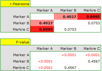
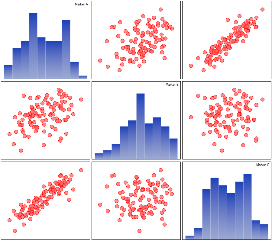
For the interval scale, assuming normality of distribution, correlation can be tested by Pearson's linear correlation coefficient. The strongest correlation is for marker A and marker C (r=0.8995, p<0.0001) the weakest and not statistically significant is for marker B and marker C (r=0.0753, p=0.4567).
The described correlations can be observed in scatter plots (the X-axis of these plots is the variable described in columns, the Y-axis in rows), and the distributions of individual variables in column plots.
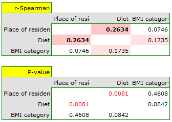
For the ordinal scale, we will check the correlation using the Spearman correlation coefficient. The only significant correlation is between diet and place of living (r=0.2634, p=0.0081).
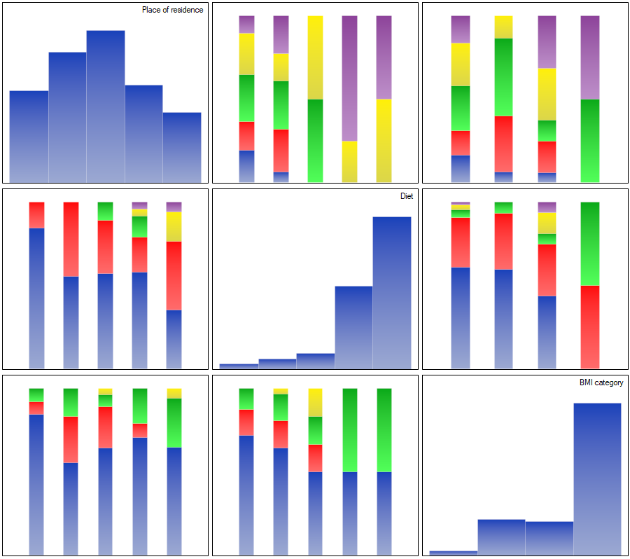
The correlations described can be observed in cumulative column plots (the X-axis of these plots is the variable described in the columns, the legend is the variable described in the rows), and the distributions of the individual variables in the column plots located on the main diagonal.
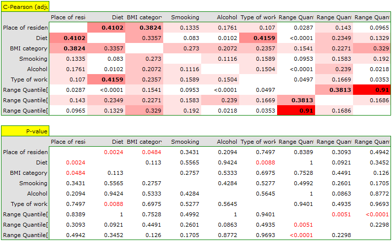
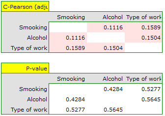
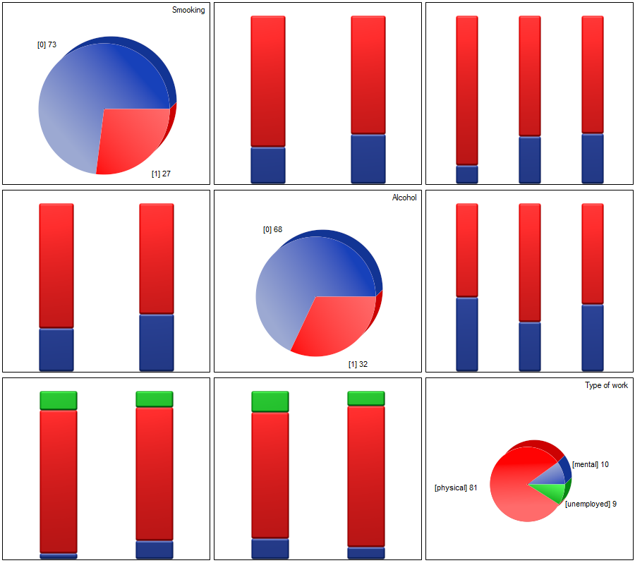
For the nominal scale, we check the correlation using the C-Pearson coefficient adjusted for chart size. We did not obtain statistically significant correlations.
Correlations, if any, can be observed in cumulative column plots (the X-axis of these plots is the variable described in the columns, the legend is the variable described in the rows), and the distributions of individual variables can be observed in column plots located on the main diagonal.
(2) The easiest way to determine correlations between variables measured on different scales is to bring them to the same scale. To do this, we will record interval data by dividing it into two categories low and high e.g. by quantiles. We can do this automatically in the transformation window via menu Data→Transformation.
![]()
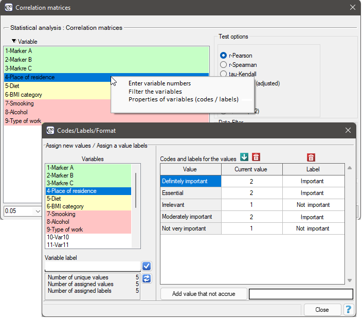
The ordinal data will also be divided into two categories, but the division will be made by selecting Variable Properties (Codes/Labels) in the analysis window via the context menu (right mouse button) and entering only the two valid values and the two labels.
As a result, we will only show the correlation matrix (without a graph), since a graph for so many variables will not be clear enough.